Please note: This website contains affiliate links. As an Amazon Associate, we earn from qualifying purchases at no additional cost to you.
5 Things To Consider When Designing Your Real Estate Logo and Brand
Ready to take your real estate business to the next level? For many agents that usually begins with building your brand and your logo. If you are ready to get started, please read this article before you jump in and have a real estate logo made!
Today we’ll cover five important things to keep in mind when creating real estate logos:
- Using a professional graphic designer (vs your semi-creative cousin)
- Selecting the best colors for your logo (and your target audience)
- Finding the correct size and shape of your real estate logo
- Creating a recognizable icon
- Requesting several variations of your real estate logo
1. Use A Professional To Create Your Real Estate Logo
There are plenty of websites and tools that will allow you to design a cookie-cutter logo, but if you are serious about building your real estate business and/or team, it is SO important to have an experienced graphic designer create your real estate logo.
Over the years, you are going to spend thousands of dollars on marketing — from websites to real estate signage to print advertising — so why not maximize your marketing spend with a logo that will really stand out from the crowd?
Typically a graphic designer will charge between $500 and $4,000 to design your real estate logo, but there are other options that are a bit more economical. Here are a few of our favorites:
- LogoTournament.com — For $300, you can have designers from around the world submit logos. We’ve had several great experiences with them, where agents received between 200 and 370 logos to choose from.
- 99Designs.com – Similar to LogoTournament, you can spend between $300 and $1300 and will receive 30 to 60 real estate logos options. The more you spend, the better the designer.
- UpWork.com – This is a database of freelance graphic designers for hire. It takes a bit more research to find the best one for the job, but once you’ve formed that relationship with them, they can help you with your branding and graphic needs in the future (i.e. postcard templates, print ads, etc).
2. Find The Right Colors For Your Logo
Color is one of the most-remembered elements of your real estate logo and is an inexpensive way to make a BIG impact on potential home buyers and sellers.
Colors can create a feeling or emotion — for example, the color blue makes people feel calm and creates a sense of security or trust in a brand.
The color red evokes strong, passionate emotion and creates a sense of urgency (ex: think about clearance sales in stores), while purple makes people think of royalty or wisdom and can make your brand look imaginative or wise.
As you’ll see from the two examples, simple logos with a clean font and darker colors can make your brand appear ultra-modern, sophisticated and/or elegant. Bright colors and a more relaxed font, can make your real estate brand appear more casual and fun and possibly targeting more females than males.
“When selecting your logo color combinations and font style, you have to consider who your typical clients are and what the goals of your new team or brand will be.”
Kerry Lucasse, eXp Realty Agent/Owner
Quick example: If you typically have listings in the $300K range but want to focus on the luxury market, make sure your new logo reflects the clients you currently serve and the ones you want to serve.
Visualize your logo in front of a $300K home and a $1.5M home — how does it look? Consider the two logo examples listed above — which one is most likely on a sign in front of a luxury listing?
According to FastCompany, “85% of consumers cite color as the primary reason they buy [or use] a particular product.”
A FEW MORE TIPS WHEN CHOOSING YOUR COLORS
Try not to use more than two or three colors in your real estate logo. Why? You want to keep it simple and memorable…. and your print costs (for listing signage, t-shirts, etc) will soar if you have more than 2 or 3 colors.
Consider all the places where your real estate logo will be used. Usually, the real estate signage is the most important because that’s typically where most people will see your logo. The colors you select need to make your logo really “pop” on the signage, as many people may only see your signage for a few seconds as they drive by.
If possible, make sure your logo can be converted to black and white. If you are placing ads in newspapers or sponsoring an event and they need to add your logo to a t-shirt or program, black and white logos are typically requested. So if your real estate logo is red and green and purple, it may be difficult to convert to B&W.
Take a quiz at the bottom of this article to see which color is right for your real estate logo.
3. Choose the Size & Shape of Your Real Estate Logo
Think about all the places you will promote your real estate business: real estate signage, social media, postcards, print ads, marketing collateral, etc.
If your logo is square-shaped or is tall and narrow, make sure you have a horizontal version of your logo that you can easily add to the top of your website and other marketing materials.
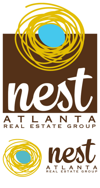
In this example, the main real estate logo is tall or vertical, which looks great on a real estate “for sale” sign and on the team’s business cards, but this format may not always work on your marketing collateral. The horizontal logo (on the bottom) was also created and it is used at the top of the agent’s website and on direct mail postcards where space is limited.
This may not seem important now, but trust us, having two versions of your logo really comes in handy!
4. Creating an Icon For Your Real Estate Logo
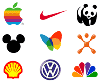
What’s an icon, you ask? Icons and symbols are compelling yet uncomplicated images that represent a particular company or product. Here are a few popular examples we’re sure you’ll recognize.
Icons are great for watermarking photos, incorporating on your website and even on marketing collateral. As your real estate brand becomes more established, your icon will become more and more memorable in the eyes of potential consumers.
5. Make Sure To Get (At Least) Four Versions of Your Logo
When you are working with a graphic designer to create your logo, make sure that they create four versions of your new real estate logo.
- The official primary version of your real estate logo.
- The horizontal secondary version of your real estate logo. This will be used on the top of your website and may be more appropriate on some of your marketing collateral – we often need to use the horizontal logos on our postcard mailers and listing flyers, because space is limited.
- The transparent (i.e. not white) background version of your real estate logo. Ideal when you need to watermark photos. Also called a PNG file.
- An all-white and all-black version of your real estate logo. If you sponsor an event or run a print ad, they may only accept a black or white logo. In the years to come, you may want to order koozies, t-shirts, keychains, or other collateral that is quite costly if the manufacturer has to do a 3-color print job. Having an all-black or all-white version of your logo can save you quite a bit of money.
When the designer sends you your final logo package, also ask that they send you the colors used in the following formats:
- HEX
- RGB
- Pantone
Although you may not care about these formats, quite often the company that creates your signage will greatly appreciate it. Also, if you work with another graphic or web designer down the road, they also will use different color formats.
LEARN MORE ABOUT REAL ESTATE LOGOS
- What Color Should Your Branding Be? (QUIZ)
- 4 Rules for Choosing the Best Branding Colors (Inman)
- The Basics of Branding Yourself or Your Business
In Summary
I hope this helps you with the first step in creating the logo for your real estate team or brand! Below are the five important things to keep in mind when creating real estate logos. If you have any questions along the way, please don’t hesitate to reach out.
- Using a professional graphic designer (vs your semi-creative cousin)
- Selecting the best colors for your logo (and your target audience)
- Finding the correct size and shape of your real estate logo
- Creating a recognizable icon
- Requesting several variations of your real estate logo
Editor’s note: This article was created by Kerry Lucasse, Agent/Owner at eXp Realty. Information deemed reliable but is subject to change.
About Building Better Agents
At Building Better Agents, we are dedicated to helping agents build successful real estate careers. We help agents develop a plan, build a database, and work smarter to uncover the keys to success as a real estate agent. All without cold calling, door knocking, and chasing expired listings. Building Better Agents Leaders Kerry Lucasse and Kary Perry are proud to be agents with eXp Realty.
For more information, please contact us today!
PIN THIS IMAGE TO SAVE AND SHARE THIS POSTS!
Ready to get more from your brokerage? Learn why agents voted eXp Realty Top Place to Work!
Please note: This website contains affiliate links. As an Amazon Associate, we earn from qualifying purchases at no additional cost to you.


